Thursday, April 30, 2015

A Vintage Journey Challenge - April 2015 - Spring Colors

Welcome to the April A Vintage Journey Challenge.  This month Astrid is our hostess and here is the challenge in her own words:  "Spring Colours - Please create a project of your choice, using the colours of Spring.  Tim's wonderful Distress products offer so many choices, just make sure Tim's style is evident in what you make."

I decided to work with a 4" x 4" framed canvas.
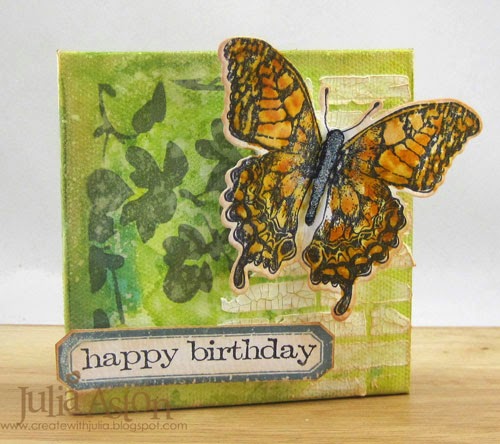
First I dropped some Wendy Vecchi Archival reinkers in Buttercup and Sky Blue onto my craft mat along with a splash of Rubbing Alcohol (Spirits in the UK, I think?).  I let it drip over the canvas and rubbed it again on the mat until I had a look I liked.
After this dried, I stenciled Latticework onto the canvas using Picket Fence Distress Paint and let that dry.
Next,  I stenciled Tim's new Blossom stencil (love this!) using Wendy Vecchi's Cornflower Blue ink - just on the left side of the canvas.
To add a little texture - I stenciled Wendy Vecchi's Basically Bricks with her Crackles Texture Paste - and let it dry.
While that was drying I die cut and stamped Tim's Framelits butterfly out of Watercolor Cardstock.  Then I water colored it using my water brush and Distress Markers in a similar fashion to Tim's method used on his April tags (although I didn't have enough white space to leave any!)
I die cut the center body of the butterfly out of black card stock, layered it over the butterfly and brushed on some Glitter Glaze - brushing over a little bit of the center of the wings as well - this adds a lovely shimmer IRL!  In this photo you can also appreciate the crackle on the bricks - I sponged over them with Tea Dye Distress ink to age it and show up the crackle.
I made my canvas into a birthday CARD by adhering a 8"x4" piece of Vintage Cream card stock folded in half.  I put ScorTape on the edges of the wooden frame and pressed the card against it.  This also allows the canvas to stand up quite nicely!
My butterfly is warming herself in the sun against the brick wall!
The AVJ challenge is now a monthly challenge and one randomly chosen winner will receive a £20 gift voucher from our very generous sponsor, Country View Crafts. We will continue to have our Pinworthy blog badges for the Top 3, who will be chosen by the Creative Guides.
 
I hope you will be inspired by Spring Colors using Tim Holtz style and join us in the A Vintage Journey April Challenge -  You will find all the details and some lovely inspiration from the other participating Creative Guides here.  You have until the end of May to link up!

hugs,  Julia xx

Stamps:  Happy Birthday and frame from Saying Stuff set,  inside Happy Birthday from Handwritten Sentiments set,Framelits butterfly set - Tim Holtz
Paper:  Distress Watercolor Card stock - Ranger, Vintage Cream - Papertrey Ink.
Ink:  Wendy Vecchi Archival Reinkers - Buttercup, Sky Blue; Archival Jet Black, Wendy Vecchi Coneflower Blue, Ranger Distress Tea Dye.
Accessories:  4" x 4" framed canvas - Michaels, Distress Markers Wild Honey and Spiced Marmelade, waterbrush - Ranger, Wendy Vecchi Crackled Texture Paste and Basically Bricks Stencil, foam tape, Glitter Glaze - MFT.

Tuesday, April 28, 2015

PTI Make it Monday - Using Vellum

This week's Make it Monday from Papertrey Ink is to use vellum to soften a background pattern.  Lizzie has a great video tutorial and some pretty samples to illustrate this technique here on the challenge post.
I needed some wedding cards for my stash so decided that's what I would create. I recently purchased the pretty Luxe Foil Desigher Papers that are perfect for a classy card. The gold is a bit bright and shiny though - and layering the vellum on it softened it nicely.  I ended up making two cards using this technique.
 I gold embossed one of the sentiments from the Love and Marriage set onto the vellum and attached the vellum just along the top of the Luxe Foil paper with Vellum Glue Dots.  I layered the Luxe panel to a Brushed Gold Panel and than all of it to the white card base.
Here I've lifted up the vellum to show how bright  the gold is without the vellum overlay
I used another pattern in the Luxe Foil Designer papers for my 2nd card - along with two more stamps from the Love and Marriage stamp set.  This time I adhered the vellum with 3 tiny gold brads in the corner of the frame.  I also put some of the Vellum Glue Dots along the top edge.
And a view of this Luxe paper without the vellum overlay.
I love how both of these came out - a fun technique to soften a bright background.
Thanks for stopping by today!


Stamps:  Love and Marriage - PTI
Paper:  White, Luxe Foil Designer Paper - PTI, Vellum,  Brushed Gold Cardstock - SU
Ink:  Versamark
Accessories:  Gold Embossing Powder, gold brads, Vellum Glue Dots.

Sunday, April 26, 2015

Destination Inspiration - A Birthday Cone

Hi Friends!   Today I'm posting over at A Vintage Journey -  the Creative Guides -Monday Destination Inspiration.  For each Monday this month we had to use this 'recipe'.
Product - Distress Paint
Substrate - Canvas
Technique - Grungepaper flowers (Vol 1 of Tim's CC Book, page 65)
Color - Picket Fence
If you'd like a look-see at the other 3 sides of my cone and how I put this together -  please click here!

And just a reminder - you still have time to join in the A Vintage Journey "Through the Looking Glass" challenge - it's open until April 30th.  Check it out here.

Hugs xx -   Julia

Saturday, April 25, 2015

A Great Day of Crafting!

Just a quick post to share all the wonderful things I made today at the two workshops taught by Richele Christensen (a member of Tim's team) at Absolutely Everything in Topsfield, MA

The first class was Distress is Best and we made 4 cards using everything Tim Holtz.  Here's Richele (in the scarf) talking about what we are going to be doing on our first card.  That's my friend Anne Harmon front foreground right.  We signed up for the classes together.
Embossed stencil with Distress Stain background, Distress Stain ribbon, Butterfly stamped by coloring stamp with Distress Markers, spritzing with water and stamping, then going over stamping with Water brush.  Roses colored with Alcohol Ink
Stencil using paste background, colored with Distress Stains.  Stampings colored with Distress Markers then went over with Detail Water Brush
Used 3 colors of Distress Markers with Distress Spritzer to color through Stencil for background.  Colored stamping with Distress Markers then went over with Detail Water Brush.
Inked over stencil with Distress Inks, sprayed stencil with water, then pressed against background panel.  Used Distress Markers with Distress Spritzer on stamping of Sea Horse, colored 2nd stamping of sea horse with Distress Markers and Distress Spritzer, then sprayed with water, cut out and layered over first stamping.
Here's another friend that was at the class today-  I met Heather, 2nd from left, a few years ago at this same craft shop when we both took a class with THE Tim Holtz.
The 2nd workshop was called Creative Collection Folio.  Richele had a lot of the papers already cut for us (covers and inside panels) and the kit included with the class had rub ons, a package of ephemera, ribbon, tags, Chit Chat Stickers and lots more for us to adorn the many surfaces on this fun folio.
I didn't add any photos yet but it's ready for them!
We used stencils on the little divider pieces.
We colored the extra tags using Distress Stains sprayed on our craft mats along with spritzed water, then dragged the tags through the mix.
What a great creative day we had -  and I go back tomorrow for one more workshop where we'll be making a Mini Configuration Book that includes one of Tim's Mini Lanterns that really lights up!


Friday, April 24, 2015

Tim Holtz April 2015 Tag

Yikes! It's almost the end of April and I'm just squeaking in my version of Tim's April tag!
You'll find Tim's tags and his tutorial on his blog here
And here is my version.   I don't have Tim's new flower stamps but I do have his new Fresh Brewed Blueprint set so I used this fun coffee cup on my tag.
I used 'coffee' colors for watercoloring with the Distress Markers - Weathered Wood, Brushed Corduroy, Scattered Straw and Gathered Twigs.  I used my new word dies - Celebrations Words - Script and Celebrations Words - Block
I won't go into all the details as you can see the techniques used over on Tim's Blog.
Appropriately enough -  I used Latte Adirondack Alcohol Ink on the Mirrored Stars!  And I even did the stitching with the little sewing machine DH got me for Christmas.  This would make a great birthday card for a gift of coffee for a coffee loving friend don't you think?
Have you got plans for the weekend?   I'm going to my local craft shop, Absolutely Everything in Topsfield, MA, to take 3 classes (2 on Sat and 1 on Sun) with Richele Christensen who is on Tim Holtz' team of teachers and designers - whoo hoo!!  The first class we're making cards -   Distress is Best , for the 2nd class we're making a Creative Collection Folio and on Sunday we're making a Configuration Book Down by the Sea theme. 


Thursday, April 23, 2015

Fusion Challenge - April 23rd - Vintage Floral

Spring has FINALLY come to Massachusetts - we are having days in the 60's and beautiful sunshine and today's Fusion Challenge is just as bright and sunny -  it makes me happy just looking at it!  How about you??
The sketch was a little bit busy for my taste - so I went with the photo - the colors, the flowers, the background and vintage look.  First, I stenciled my back panel with Wendy Vecchi's Basically Bricks stencil and Archival Dandelion Ink.  The blooms and sentiment are from Old Country Roses and the seed packet is from Vintage Garden Seed Packet - both by Waltzingmouse.  I popped everything up on foam dots. 
I hope you are inspired by this fun new Fusion Challenge and that you link up your creation over at the Fusion Blog  - where you will also find some wonderful inspiration from the rest of the Fusion Design Team!

Stamps:  Old Country Roses and Vintage Garden Seed Packet - Waltzingmouse
Paper:  White, Spring Rain, Harvest Gold - PTI
Ink:  Archival Jet Black, Wendy Vecchi Archival Dandelion, Ranger Distress Mustard Seed, Rusty Hinge, Fired Brick, Peeled Paint, Pine Needles;  Pure Poppy - PTI
Accessories:  Basically Bricks Stencil - Wendy Vecchi, foam dots.

Saturday, April 18, 2015

A Little Domed Church

First - thanks for the get well wishes for my cold, several of you left on my last post!  I finally went to the doctor on Wednesday and she diagnosed sinusitis - so I'm on antibiotics, Sudafed and Flonase nasal spray.  I'm feeling a little better and hopefully with 7 days on the antibiotic it will all clear up.

I wanted to share a project I made as a fund raiser for my church.  We recently had 26 new windows installed in several rooms of our church and, although we got a partial grant from our diocese, we still had to raise $500 for each window.  People have been donating and we have about 2/3rds paid for - but I had this idea when I saw the wonderful little church die from Papertrey Ink. 

First I must give credit - my design was totally inspired by Amy Sheffer's project using these dies here.
Below is my finished little dome scene.
I made 12 of them -  using the PTI Scene It Basic Backer Die with the Spring Rain, a slightly smaller Nestability circle with the Spring Moss and Rustic Cream with the Petite Places Church dies, and the Pop Up Tree dies.  So here are all the pieces cut out.
Our church is cream and brown - so I stamped the Petite Places Church stamps in Rich Cocoa over the Rustic Cream cardstock.
I easily assembled each little church using Scotch Quick Dry Adhesive on the edges - you could also use something like ScorTape.  See how tiny it is in my hand!  LOVE IT!!!  You can punch out each pane of window - but I left mine intact.
I hand drew a little walkway out of the Rustic Cream to fit the space I wanted and adhered that and the church onto the Spring Moss Circle.  I also layered some of the green under the circle to cover the holes left by the trees when you pop them up.
Here is a photo of our church -  St. John's Episcopal, Saugus, MA
I purchased some greenery used for miniature railroads or scenes at a local art shop - called Foliage Clusters/Bushes by Wee Scapes to use around the church.  PTI sells something similar here - but I wanted mine more dense and I like how it worked out!  I just spread some Scotch Quick Dry Adhesive around the church and trees and pressed the greenery onto it.  I added some flower sequins I had in my stash to the bushes for spots of shimmer and color.
 Here are several of them on my work table - I just love miniature things!
I adhered the clear dome over the scene by running the Scotch Quick Dry adhesive along the edge of the dome and carefully placing it over the scene - outside the green edge.  I typed what I wanted on the tag on my computer and printed it on the Rustic Cream cardstock.  I used the Key Tag Punch from SU, punched a hole on the side and looped some Cappuccino Twine through the tag and then tied it in a bow through the loop on the dome.  I then layered the whole thing to a slightly larger scalloped coaster I had in my stash.
And here it is -  how cute ??!!
Here are the 12 -  all completed - even MORE cute. 
A view from the back - sorry for the glare - it's really hard to get a picture of these!
A view from the sky...
Thought I'd also share the poster I made for the window campaign.  I die cut 26 Poppy Stamps windows and 26 small suns from Lil'Inker Designs.  Whenever enough money is collected to pay for one window -  they stick a sun on that window -  we now have suns shining through the top three rows of windows!
Now I hope they sell!
Thanks so much for stopping by today -   I hope you are having a great weekend!  I'm looking forward to hosting my sister's 65th b'day party tomorrow with the family.